Exware is now working remotely! For quickest response, please contact us by .
Book a Demo

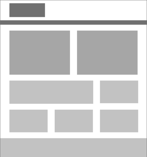
Responsive design is a way to make your website automatically change its layout depending on the type of device you are using to view it:
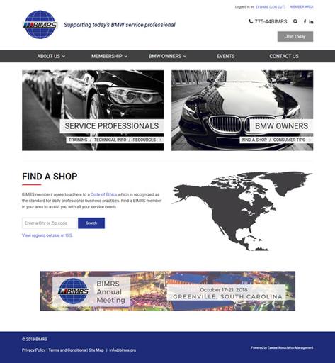
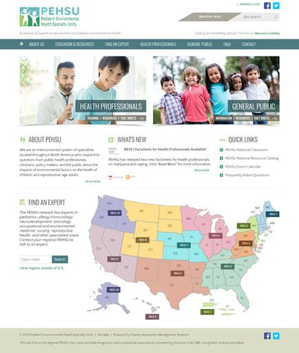
On a large, high-resolution screen such as a computer monitor, you can enjoy rich layouts with many items displayed side-by-side or in multiple columns.
On intermediate-sized screens such as iPads and mobile tablets, you can get a little of both, making optimal use of the display area that is available.
On a small mobile phone screen, the content will automatically adjust to a simpler layout so that you can enjoy it without having to zoom and pan.
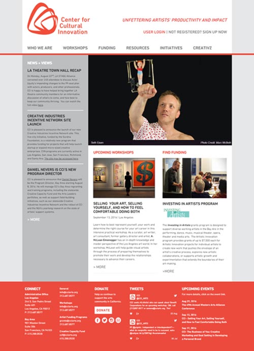
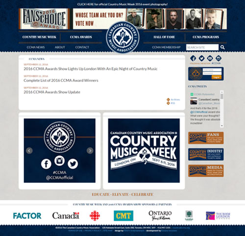
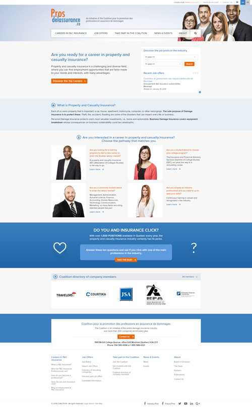
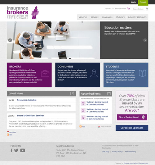
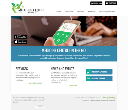
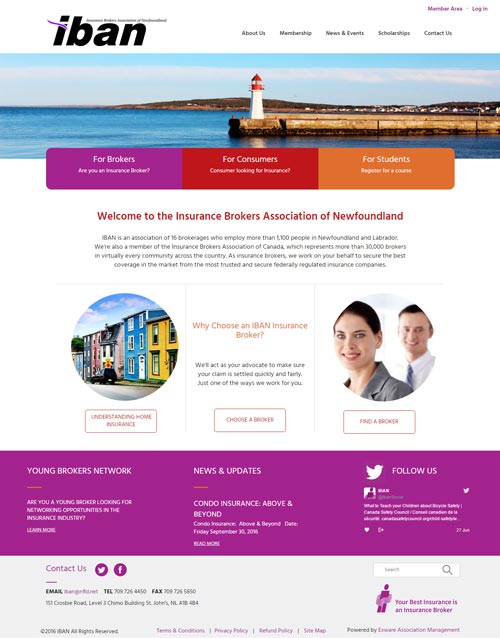
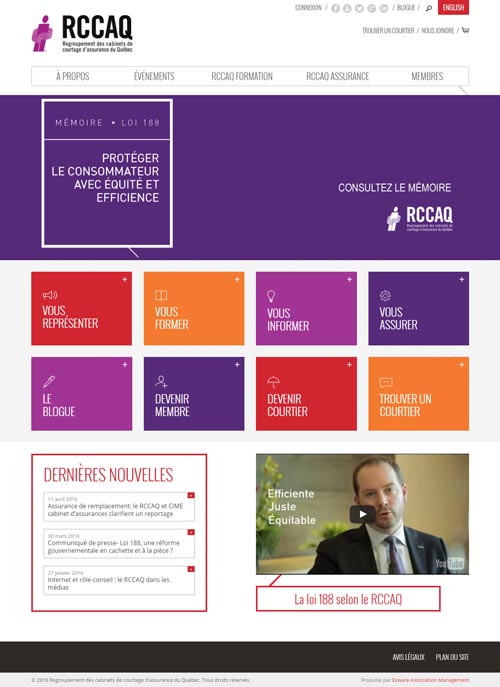
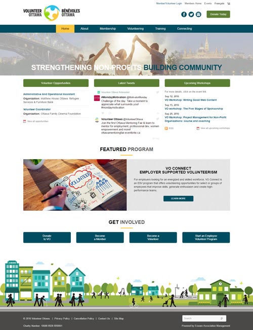
All Exware Systems include responsive design. You will be able to choose a responsive prototype that Exware's Design Team will customize to meet your organization's brand and vision.
Clients select a responsive prototype and Exware provides with customized and fully branded desktop and mobile mock-ups.